Tuesday 17 January 2017

Copyright Request


Conventions of a Music Video

Conventions of a narrative music video

  • A music video generally can be a non-linear or a linear narrative
  • A music video can also be closed or open.
  • With a narrative there is a beginning, middle and an end.
  • The events must make sense to the audience 
  • It must be suggestive or at least imply what the intended reading is

Conventions of a group performance music video

  • Generally there is a performance in the music video, where the audience sees the band either lip syncing or we see them on stage performing. 
  • Mimed playing of instruments 
  • Close-up shots of the singers face and the instruments being played
  • Unusual camera shots; for example low close angles of the instruments 
  • Crane shots over the audience 

Conventions of a solo performance music video


  • Close-ups of the singer; emphasising them and that they are the main focus of the video
  • A dance routine involved to bring the audience's attention
  • First person mode of address so that the audience feels a connection with he singer and gets involved
  • Often cutting between performance and narrative so that the audience want to keep watching

Star image 

  • Certain profit stars will be selected and manufactured for the record label. 
  • We are able to connote the meta narrative in music videos - this is where we are able to identify a stars personality and apply it to the music video. 
  • stars such as; Madonna and Micheal Jackson were manufactured to be marketed in a certain way so that their record label could gain a profit

Friday 6 January 2017

Magazine Album Advert Analysis

All Time Low 'Nothing Personal' Kerrang Magazine Advert
  • Artist name large font, centre, top of the page
  • Social media link in a smaller font underneath the band name
  • Album name highlighted in contrasting colour to the background and other text
  • Album name in a smaller font to the band name with a more simple font of the date of release centrally beneath that
  • Iconography, featuring band members, outlined with they yellow colour scheme
  • Album cover also displayed small, next to band members
  • The advert follows the same aesthetic of the album cover, yellow, album name with the same yellow highlight and the band have the same font and relatively same size font compared to album name
  • Contains record label twice
  • Also has the store where you can buy the album, with extra information of a digital download
Biffy Clyro 'Mountains' Kerrang Magazine Advert

  • The magazine advert is identical to the album artwork
  • Band name and album name font made much larger and placed in the lower half of the advert
  • Font size appears to be in descending order, all having a cold blue and white colour scheme
  • Information for date of release
  • Information about contents of what you will receive when buying the album
  • Band website
  • At the bottom of the advert is their record label '14th Floor'


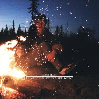
Moose Blood 'Blush' Social Media Promotional Tour and Album Advert
I was unable to find a magazine advert for Moose Blood's most current album 'Blush' online. However, I have found this promotional UK & Europe Tour that also promotes their album. I can at least take inspiration from the aesthetic of the band.
  • The scheme is constant throughout, sticking to black and white, pastel pink and baby blue.
  • Band name in hollow, capitalised, italic font
  • Split the band name with pastel pink line and baby blue stars, contrasting with the white fonts for the other band names
  • Back to the pastel pink on a black background, split the different dates with the different colours. (Europe in pink, UK in blue)
  • Band website underneath all the dates, following colour scheme
  • Record label and production companies beneath the sign
  • Actual album advertisement bottom right with the name of the album in the same font as the band name, date of release smaller underneath
  • The whole advert is very Americanised with that American aesthetic, can be seen with the 60's American Diner-esque sign that it has been made to look like.
  • The actual image behind the sign appears to have been taken in L.A, California.

The 1975 'I Like It When You Sleep For You Are So Beautiful Yet So Unaware Of It' Promotional Image - 'Somebody Else'
The 1975 'I Like It When You Sleep For You Are So Beautiful Yet So Unaware Of It' Promotional Image - 'This Must Be My Dream'
 This is not a magazine advert, however I would like to take inspiration from this. I would like to have teaser advertisements for the album by having songs from the album displayed with my own photography. Although, neon lighting would be extremely expensive so I would have it digitally imposed onto my photography. The photography may be still images from the video, or simply photos of locations within the video.

Thursday 5 January 2017

Digipak Conventions

Genre Related Digipaks

Moose Blood Digipak

Moose Blood 'IKYIM' Digipak Front Cover
  • Simple range of colours
  • Minimalistic image
  • Warm but dark colours
  • Simple band name in relatively small capitalised font
  • Same font album name underneath band name, split with simple line.
  • No iconography
Moose Blood 'IKYIM' Inside Cover
  • Reoccurring theme of the fire
  • Album name split between each side of the cover "I'll Keep You In Mind" "From Time to Time"
  • Track list shown horizontally across cover, underlined by same line on front cover
  • Lyrics of each track shown under each relating track name
  • Credits at the bottom, band members, producers, engineers, assistant engineers, programming, location of recording, photographers, layout and design company.
Moose Blood 'IKYIM' Back Cover

  • Warm fire theme again
  • Band logo at the top
  • Central vertical tracklist
  • Record label information and copyright information in the bottom left
  • Barcode in the bottom right
Taking Back Sunday Digipak


Taking Back Sunday 'New Again' Digipak Front Cover


  • It has been given an aged, distressed appearance
  • Light colours, contrasting with the red interior of the car
  • 90's punk band with a vintage aesthetic, verisimilitude with the car and the outfit of the woman
  • Contents of digipak displayed with a rustic sticker
  • Trigger warning in the bottom left

Taking Back Sunday 'New Again' Digipak Inside Cover
  • Track list underneath the album name (same font but a different colour)
  • DVD credits on right hand side of the cover.
  • Left side of the cover has credits for the album, including: producer, engineers, additional producers and engineers, mixers, recording studio and location, assistants, additional recording studio and location, publisher, band members, art design and band photographer, manager, lawyer, agency, business management, executing producer, marketeers, copyright information with record label, and finally band website.
  • With the credits they also had mentions such as: family, friends and products that they used to make the album.

Neck Deep Digipak


Neck Deep 'Life's Not Out To Get You' Digipak Front Cover
  • Vibrant, abstract artwork
  • Related to the album title, events that you meet along the way in life
  • Hand drawn fonts and pictures
  • Band name at the top off-centre in red, on a contrasting yellow
  • Album name at the bottom with a simple black on white 
Neck Deep 'Life's Not Out To Get You' Digipak Back Cover

  • Similar hand drawn artwork
  • Same font used for the track list as it was for the album name on the front
  • Appears to symbolise a cartoon, mythical map that depicts the journey of the album, following on the theme of a journey from the front cover