Showing posts with label Marketing. Show all posts

Tuesday, 7 March 2017

Magazine Advert


The colour scheme of the magazine advert correlates directly with the digipak's colour scheme. The background is minimalistic using only three alternating colours in text and no image of the band. But instead shows the band logo as the focal point of the advert - this is the same in the digipak. Other magazine adverts have done something similar, for example, punk rock band 'Green Day' and also 'Foo Fighters'. Conventionally, I have also made the name of the band the biggest text on the advert and the name of the album underneath the band in a smaller font. As I have seen on other magazine adverts in a similar genre (Biffy Clyro - Mountains). The information about the date of release was found in the bottom half of the advert, along with the possible ways of accessing the music. Furthermore, I also decided to use another magazine advert convention of having the record label displayed somewhere on the advert, either by name or logo. Finally, I added the website for the band/record label in a white font that contrasted to the colour scheme that I was using throughout.

Thursday, 2 March 2017

Digpak Process


Original Digipak Template
I downloaded a standard digipak template and imported it into Adobe Illustrator.


Digipak With Background
I then created a square using the Rectangle Tool and filled it in with the pink colour I wanted by using a Digital Colour Meter and adjusting the colours on the RGB scale.


Album Title and Band name (Front Panel)
I went on to dafont.com and found two fonts that I felt fit the theme of my digipak. The album title 'Blush' is in a bold font that stands out and compliments the pink background. It could be classified as  an American style stencil font as 60's America was an inspiration for the design. The band name 'Moose Blood' is in the same vein, I used a light blue in contrasting gentle, handwritten font that reflects a font that the band used to use on their merchandise.

Track List (Reverse Panel)
On the reverse panel I have the track list in black and in the same font as the band name down the centre of the panel. I did this using the Type Tool, and the Fill Tool to colour the text.

Band Logo Added (Front Panel)
Using the Line Tool I traced the band logo for the straight lines. However, I had to use the Ellipse Tool to do the teardrop shape. From there, I edited an image of a live performance of the band on Adobe Photoshop and imported it to Adobe Illustrator. I used the hollow logo to use as a stencil to cut out from the image and leave me with a filled in logo using my image.

Band Logo Added (Reverse Panel)
I simply copy and pasted my previously created outline of my logo onto the reverse panel and adjusted the scale.

Licensing Information and Barcode Added (Reverse Panel)
I found a .png image of Moose Blood's record label 'Hopeless Records' and imported it into Adobe Illustrator and using conventions I had researched I placed it on the left of the licensing information (that I also based upon research I had done of other licensing information). Finally, I found a font that creates barcodes with text and used a band themed barcode.

Spine of Digipak
I created another rectangle using the Rectangle Tool and used the Fill Tool to make it black. From here I used the Type Tool to create text and adjusted the text's RGB scale to be the same blue as the blue in the band name on the front panel. I placed the text to be able to read when the album is face up as I had read that this was the true way to place text on a spine.

Inside Panels of Digipak

I researched all the lyrics of the songs on the album and wrote them out in the another font that I found on dafont.com that fit the gentle theme of the digipak.

Full Basic Digipak

Full Digipak Without Inside Panel Details

During filming I took a still image of a shot that I had just finished shooting. I then took this image and edited it on Adobe Photoshop to make it black and white and using the colour guide I made sure that the black was absolute black and that the white was absolute white. I then imported the image from Photoshop and on to Adobe Illustrator to take the place of the black background I had previously.
Complete Inside Digipak

I then brought the text layer forward so it was on top of the image.
Complete Full Digipak

Friday, 17 February 2017

Digipak Ideas

I took initial inspiration from the band's most recent album's colour scheme and also the colour scheme from a recent EP 'Stay Beautiful'

Moose Blood - Blush, Album Cover

Moose Blood - Stay Beautiful EP Cover

I began with the idea of making a black digipak with the pink/purple details, but the text did not stand out as I had liked, also another issue was also the .png image of the record label could not be accessed in another colour other than black, thus making it not visible. I know I want to make it minimalistic and simple with not many details such as New Found Glory's 'Resurrection Ascension'. 

New Found Glory - Resurrection Ascension, Album Front Cover
I found in many products that lyrics of the songs were found on either a pull out or on the inside cover of the digipak. This translated over many genres from Indie Rock, Singer/Songwriter and Punk. That's where I came up with the idea of having the lyrics somewhere on the digipak.

I don't want to use fonts that can be found on previous digipaks but instead fonts that have been used on merchandise.


Friday, 6 January 2017

Magazine Album Advert Analysis

All Time Low 'Nothing Personal' Kerrang Magazine Advert
  • Artist name large font, centre, top of the page
  • Social media link in a smaller font underneath the band name
  • Album name highlighted in contrasting colour to the background and other text
  • Album name in a smaller font to the band name with a more simple font of the date of release centrally beneath that
  • Iconography, featuring band members, outlined with they yellow colour scheme
  • Album cover also displayed small, next to band members
  • The advert follows the same aesthetic of the album cover, yellow, album name with the same yellow highlight and the band have the same font and relatively same size font compared to album name
  • Contains record label twice
  • Also has the store where you can buy the album, with extra information of a digital download
Biffy Clyro 'Mountains' Kerrang Magazine Advert

  • The magazine advert is identical to the album artwork
  • Band name and album name font made much larger and placed in the lower half of the advert
  • Font size appears to be in descending order, all having a cold blue and white colour scheme
  • Information for date of release
  • Information about contents of what you will receive when buying the album
  • Band website
  • At the bottom of the advert is their record label '14th Floor'


Moose Blood 'Blush' Social Media Promotional Tour and Album Advert
I was unable to find a magazine advert for Moose Blood's most current album 'Blush' online. However, I have found this promotional UK & Europe Tour that also promotes their album. I can at least take inspiration from the aesthetic of the band.
  • The scheme is constant throughout, sticking to black and white, pastel pink and baby blue.
  • Band name in hollow, capitalised, italic font
  • Split the band name with pastel pink line and baby blue stars, contrasting with the white fonts for the other band names
  • Back to the pastel pink on a black background, split the different dates with the different colours. (Europe in pink, UK in blue)
  • Band website underneath all the dates, following colour scheme
  • Record label and production companies beneath the sign
  • Actual album advertisement bottom right with the name of the album in the same font as the band name, date of release smaller underneath
  • The whole advert is very Americanised with that American aesthetic, can be seen with the 60's American Diner-esque sign that it has been made to look like.
  • The actual image behind the sign appears to have been taken in L.A, California.

The 1975 'I Like It When You Sleep For You Are So Beautiful Yet So Unaware Of It' Promotional Image - 'Somebody Else'
The 1975 'I Like It When You Sleep For You Are So Beautiful Yet So Unaware Of It' Promotional Image - 'This Must Be My Dream'
 This is not a magazine advert, however I would like to take inspiration from this. I would like to have teaser advertisements for the album by having songs from the album displayed with my own photography. Although, neon lighting would be extremely expensive so I would have it digitally imposed onto my photography. The photography may be still images from the video, or simply photos of locations within the video.

Tuesday, 22 November 2016

Artist Research: Moose Blood

The Background

Moose Blood are a self-proclaimed Emo-Punk band formed in Canterbury, Kent in 2012. In many of their songs they reference inspirations such as Brand New - a band that were 'big' in the Pop-Punk scene in the 90's and early 2000's. Also in their first album there were more references to other bands that influenced them in the 2000's such as Saves the Day and Say Anything.

When they formed in 2012 they released a demo for the song 'Bukowski' which became one of their most popular songs even currently.


After this, they worked on an EP named 'Moving Home', this contained: an instrumental that opened the EP called 'My Own Boat', 'Evening Coffee', the title track 'Moving Home', 'Carbis Bay', 'Drive' and finally the reworked version of 'Bukowski'. Their sound in this EP is very raw and is not altered much in post-production. Shortly after this, they also released two songs as singles 'Boston' and 'Orlando'.


November 2013, they collaborated with another small band 'Departures' to make a second EP, 'Departures/Moose Blood Split EP'. The only two songs from Moose Blood are 'Stay Here' and 'Girl'.


In 2014 they signed to No Sleep Records, a record company that many large punk bands such as Blink-182 have been signed to at some point in their careers. At the end of 2014 they went to the base of No Sleep in LA released their first album 'I'll Keep You In Mind From Time to Time'. It was well received in the US, it came in at number 9 on Rock Sound's 'Top 50 Albums of the Year' list and 45 in the US Billboard Heatseekers Albums.


More recently in 2016 they announced that they had signed to Hopeless Records for their new album. Their second album, titles 'Blush' is much less raw as they have a higher budget, this also means that the chances are that budget would also reflect in their music video productions but I do not have that budget as an A Level student.


Marketing

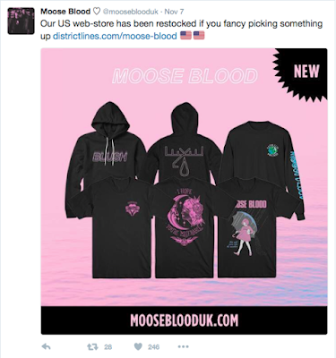
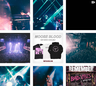
Moose Blood often use social media to market their products to their audience and also attempt to reach a wider audience, as they are still a new 'up and coming' band in the punk scene. They market from Facebook, Twitter and Instagram.
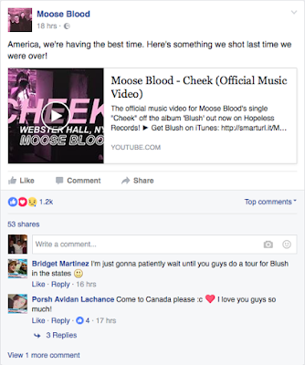
Moose Blood Marketing on Facebook

Moose Blood Marketing on Twitter


Moose Blood Marketing on Instagram


Previous Music Videos

Gum

<iframe width="560" height="315" src="https://www.youtube.com/embed/Ld88m2jLhwY" frameborder="0" allowfullscreen></iframe>


  • Narrative storyline that does not directly link to the lyrics.
  • Artist is included in the video, live performance.
  • A few of the shots relate to the lyrics but for the majority it is concept.
  • Within the video there are links to the band's own merchandise but other than that, there don't seem to be other intertextual links.
  • Throughout the video, there are no attempts to interact with the audience.
  • The actors in the video aren't famous but are still the centre of the shots, the band feature for approximately 31 shots in the whole video.
  • The video is of a medium pace, the average shot length is around 4 seconds in the first section. But after the first chorus, the shots shortened to an average of 2 seconds.
The elements I will most likely take from this is the idea of a narrative, however my narrative will almost entirely directly link to the lyrics. Also, the ratio of the narrative to the performance on screen.

Cheek

<iframe width="560" height="315" src="https://www.youtube.com/embed/JfrnlUg2p0k" frameborder="0" allowfullscreen></iframe>

  • The video is entirely concept and only contains live performance, this is similar to other videos of theirs, such as Swim Down, Bukowski and Boston.
  • All of the video is revolved around the artist being the centre of each shot.
  • Because the video is a concept live performance, the visuals don't at all connect to the lyrics.

Friday, 23 September 2016

Artist Research: The 1975

The Background

The 1975, formerly known under the names: Me and You Versus Them, Forever Enjoying Sex, Talkhouse, The Slowdown, Bigsleep and Drive Like I do, formed in 2002, Cheshire, England. They formed when they were 13 at their local school. Now they are around 27 years old - which is older than the majority of their fans. When they first begun under the name of The 1975 they were first described as being an Indie Rock band. But throughout the 14 years they have been together they have produced music progressing from Indie Rock to Electro Pop to Alternative Rock. Their first EP 'Facedown' was released in 2012 by the record company Dirty Hit, containing the songs Facedown, The City, Antichrist and Woman. This EP has a melancholic feel to it with the songs heavily referencing religion and relationships. Later that year they released the 'Sex' EP, this was the EP that started their rise in popularity in the music industry as the Alternative Rock song 'Sex' supported by Radio 1 DJ Zane Lowe and pushed them towards a UK and Ireland tour. The following year saw the release of their third EP 'Music For Cars' this is where their mainstream success and potential became apparent. The song 'Chocolate' reached number 19 in the UK Singles Chart. Also in 2013, was their second EP of the year and fourth EP altogether 'IV'. 'IV' had a new version of a popular song 'The City'. This emphasises the band's awareness of the demand from their fans while also defining the creativity that they are still known for today.  The track charted in the UK and had airtime in many other countries. However this was their last EP before the release of their self titled debut album 'The 1975'. The album was released on the 2nd of September 2013, the re-worked lead single 'Sex' from the previous EP was released a week before as part of the hype for the album. The song was an instant hit and again was supported by Radio 1 DJ Zane Lowe, furthermore the band's first music video was released on the 26th of July for 'Sex'. Their debut album reached number 1 in the UK Album Charts. The album was very much Indie Rock/Alternative Rock and had a lack of Pop influences.


Marketing
'I Like It When You Sleep, For You Are So Beautiful Yet So Unaware Of It' Album Marketing

'Somebody Else' Single Marketing

'This Must Be My Dream' Album Marketing

'UGH!' Single Marketing


Obviously I do not have the budget or the time to get any actual neon lighting as marketing for my music video but I could at least take advantage of the natural locations in my town and take a high quality photo on the Cow and Calf or on the moors. With this I can then add neon text to attempt to replicate a similar style to this.

When I create the CD case I should also attempt to take inspiration from their single and album covers.

'Facedown' EP
'Sex' EP
'Music For Cars' EP
'IV' EP
'Medicine' Single EP
'The 1975' Album Cover
'ILIWYS' Album Cover


My CD case is going to be similar to the most recent album cover (the bottom one) in the sense that its going to be all white but I want it to feature a male defying stereotypes. Possibly sticking with the pink theme. But most importantly, I will feature the famous rectangle in the centre of the shot.

Official Hoodie

Official T-Shirt

Official Vests


A reoccurring theme of their merchandise as well as album covers are the rectangles again but also the font of their band name. This could be used within my CD cover as well.